Navbar best practices
Use semantic <nav>, label icon-only controls, and test keyboard focus through dropdowns. Keep primary CTAs visible on desktop and reachable on mobile via a clear menu toggle.
Responsive navigation bars for marketing sites and web apps — sticky headers, mega menus, mobile drawers, and dark-mode nav patterns.
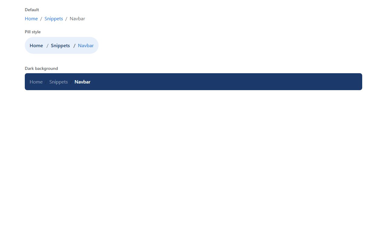
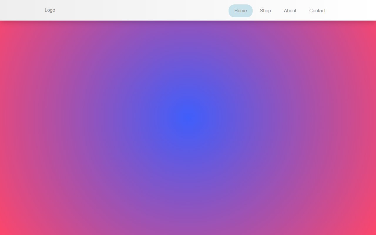
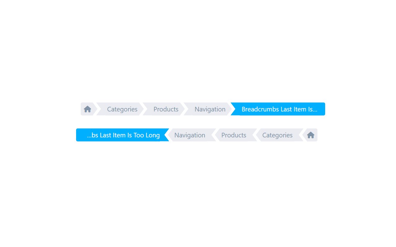
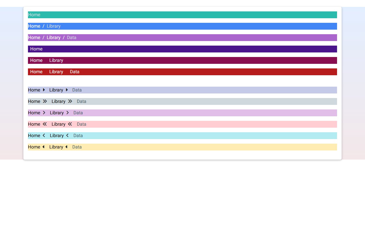
Free Bootstrap 5 navbar snippet — Breadcrumb Navigation. Preview, copy HTML, drop it into any Bootstrap 5 project.
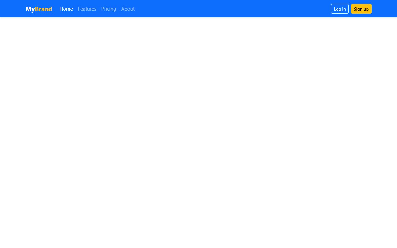
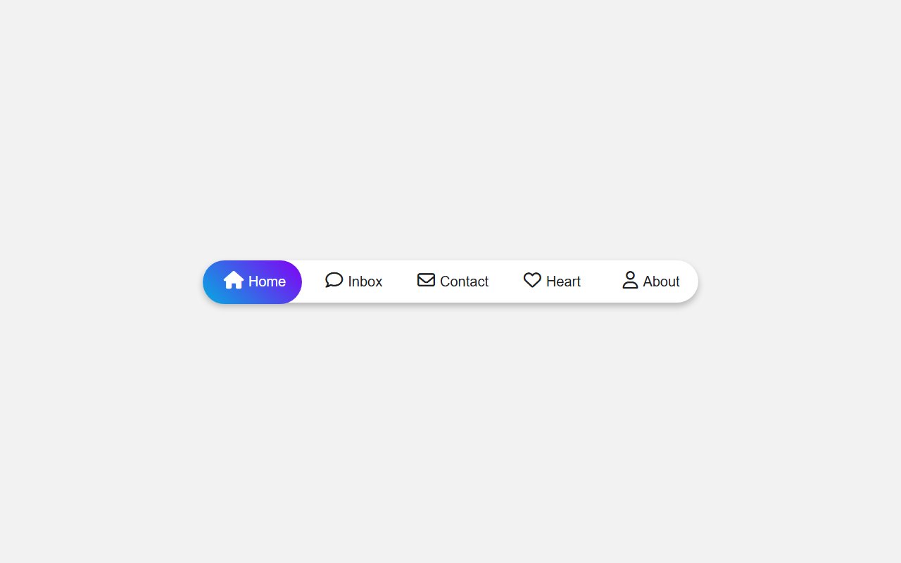
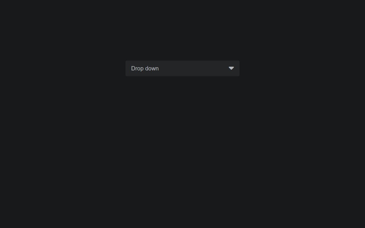
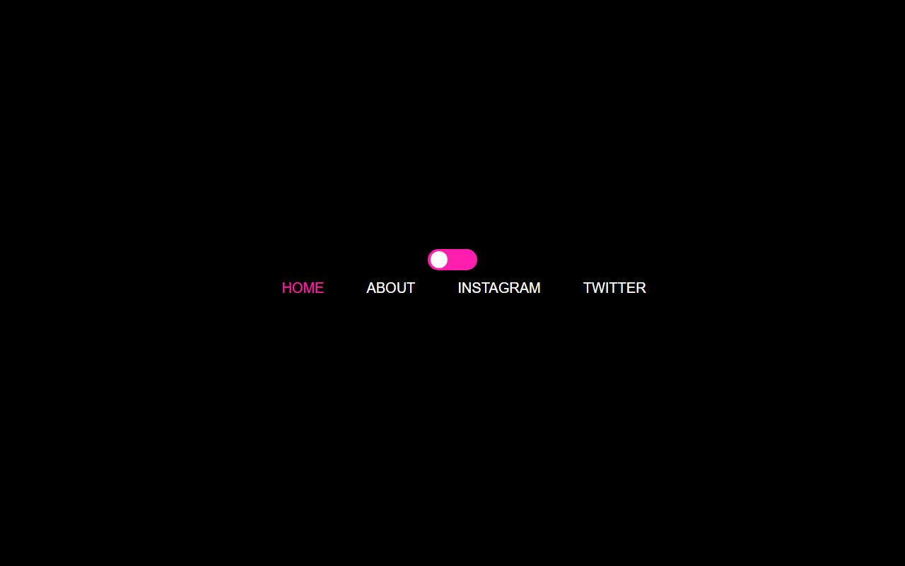
Responsive Navbar — a free Bootstrap 5 navbar snippet. Copy the HTML and paste straight into your Bootstrap 5 project.
Responsive navigation bars for marketing sites and web apps — sticky headers, mega menus, mobile drawers, and dark-mode nav patterns.
Use semantic <nav>, label icon-only controls, and test keyboard focus through dropdowns. Keep primary CTAs visible on desktop and reachable on mobile via a clear menu toggle.
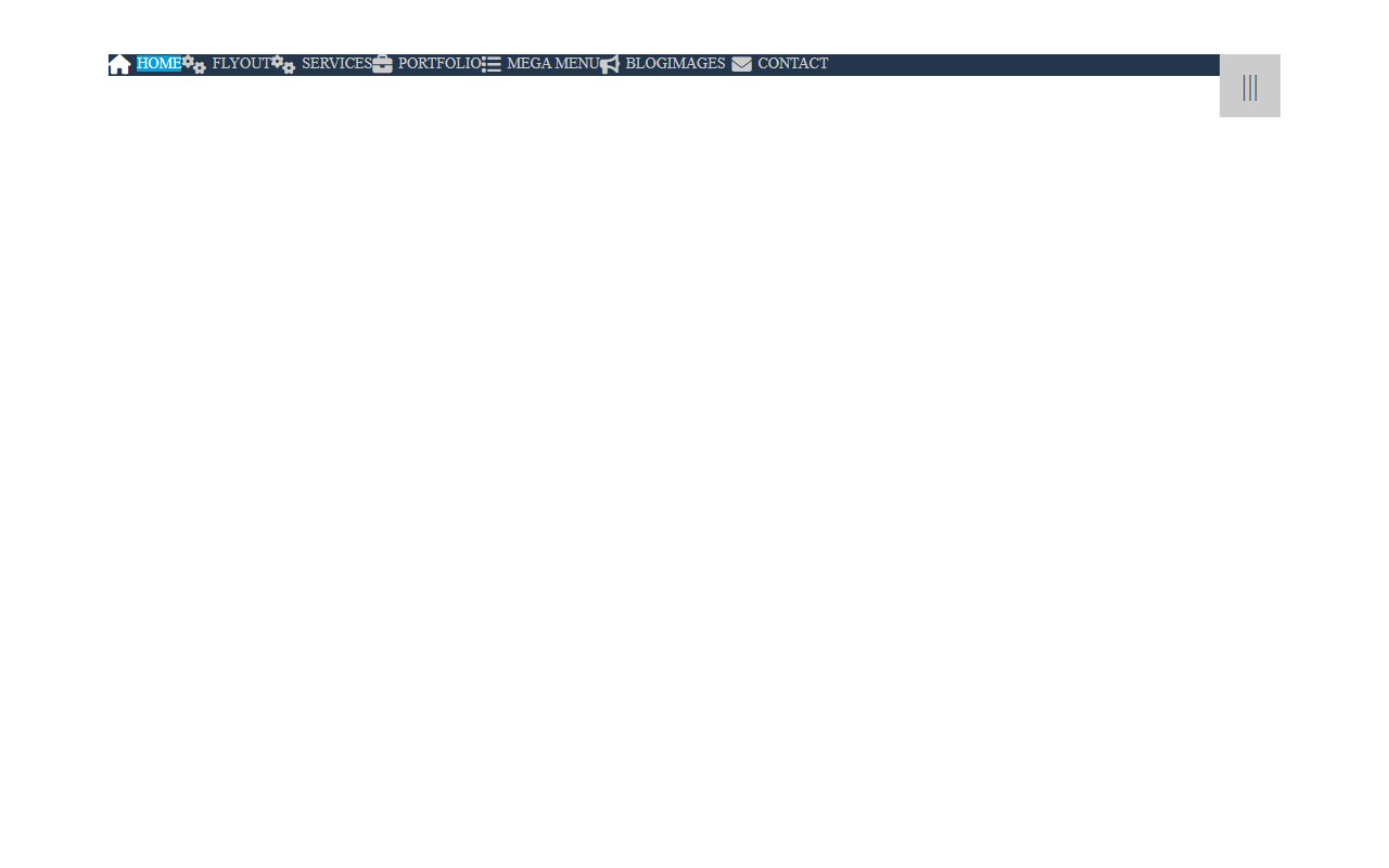
Most snippets use position: sticky or fixed with a top offset. Check each snippet preview for z-index and padding on the body.