Status indicators
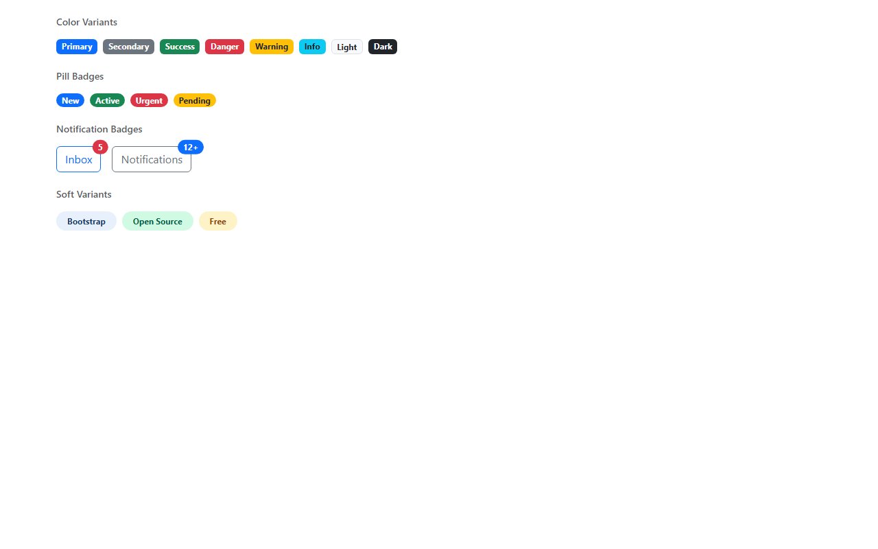
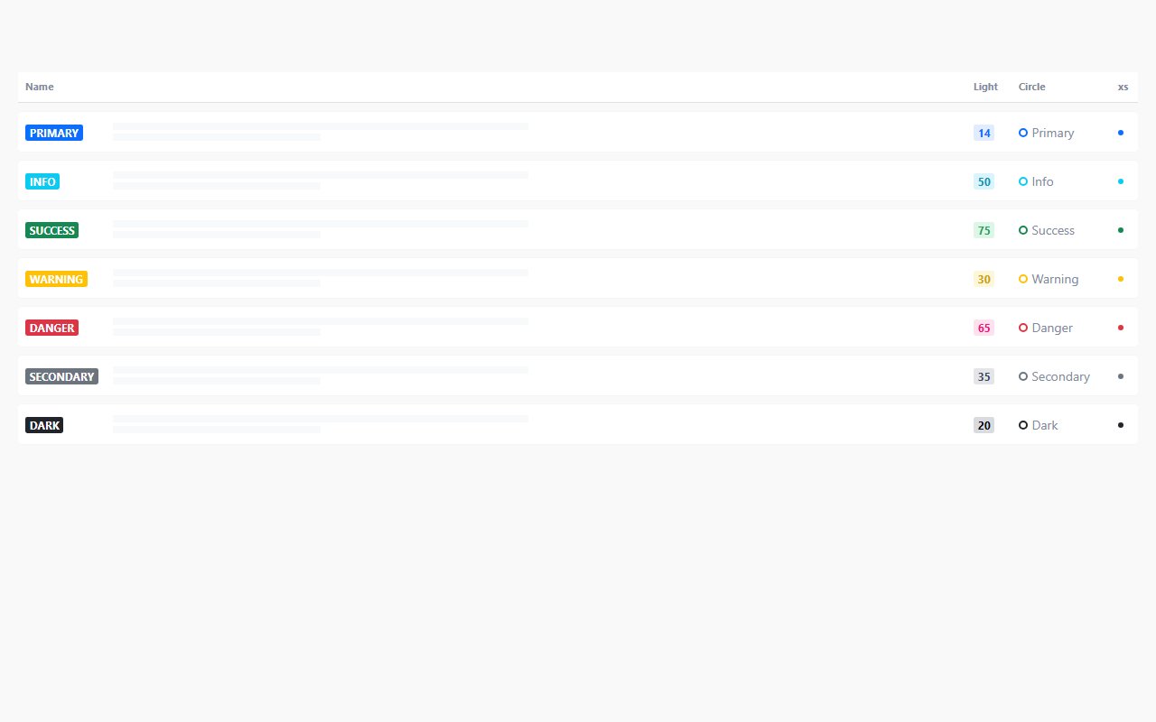
Use color consistently: green for success, amber for warning, red for errors. Pair badges with text where color alone would fail accessibility checks.
Category · 2 snippets
Labels, badges, and status indicators
Showing 2 of 2 snippets
2 results
Labels, badges, and status indicators
Use color consistently: green for success, amber for warning, red for errors. Pair badges with text where color alone would fail accessibility checks.
Yes — many snippets show badge positioning inside nav items or buttons using relative/absolute layout.