

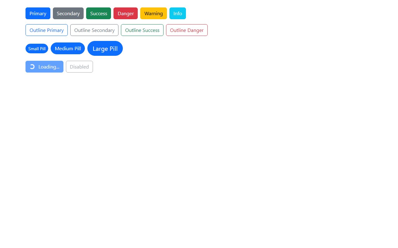
Accessible button design
Use native <button> for actions and <a> only for navigation. Include visible focus styles, sufficient color contrast (WCAG AA), and disabled states that are announced to screen readers via aria-disabled when needed.
Category · 55 snippets
Button styles, groups, and states
Showing 55 of 55 snippets
55 results
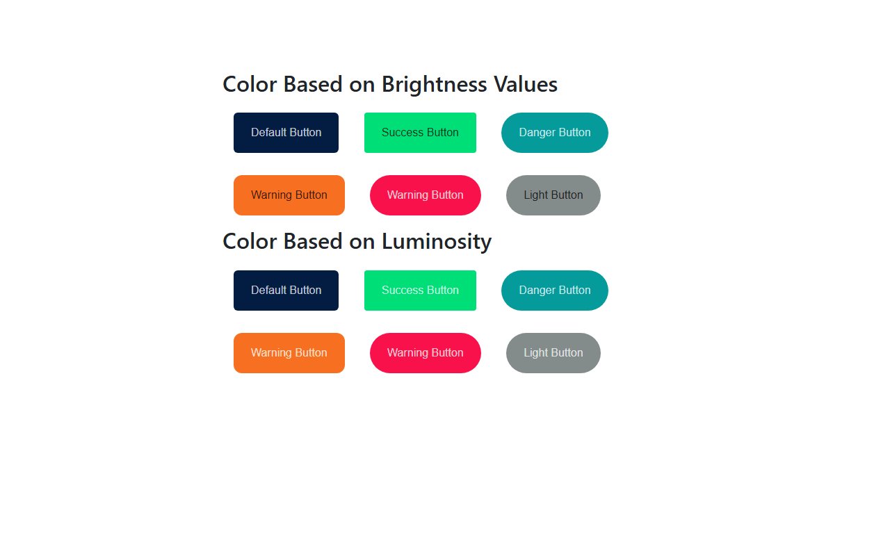
Button styles, groups, and states
Use native <button> for actions and <a> only for navigation. Include visible focus styles, sufficient color contrast (WCAG AA), and disabled states that are announced to screen readers via aria-disabled when needed.
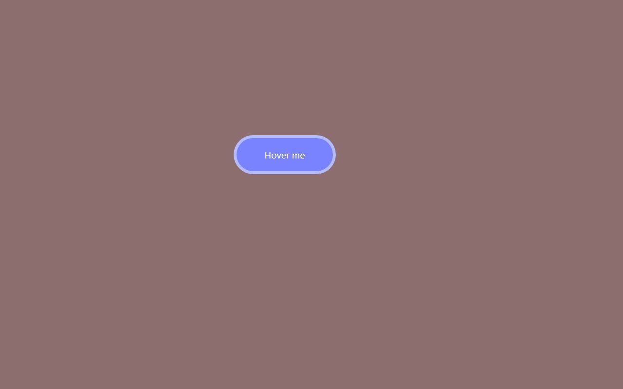
Most include :hover and :active styles or Bootstrap state classes. Check the live preview before shipping to production.