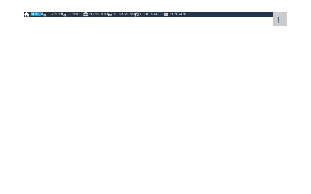
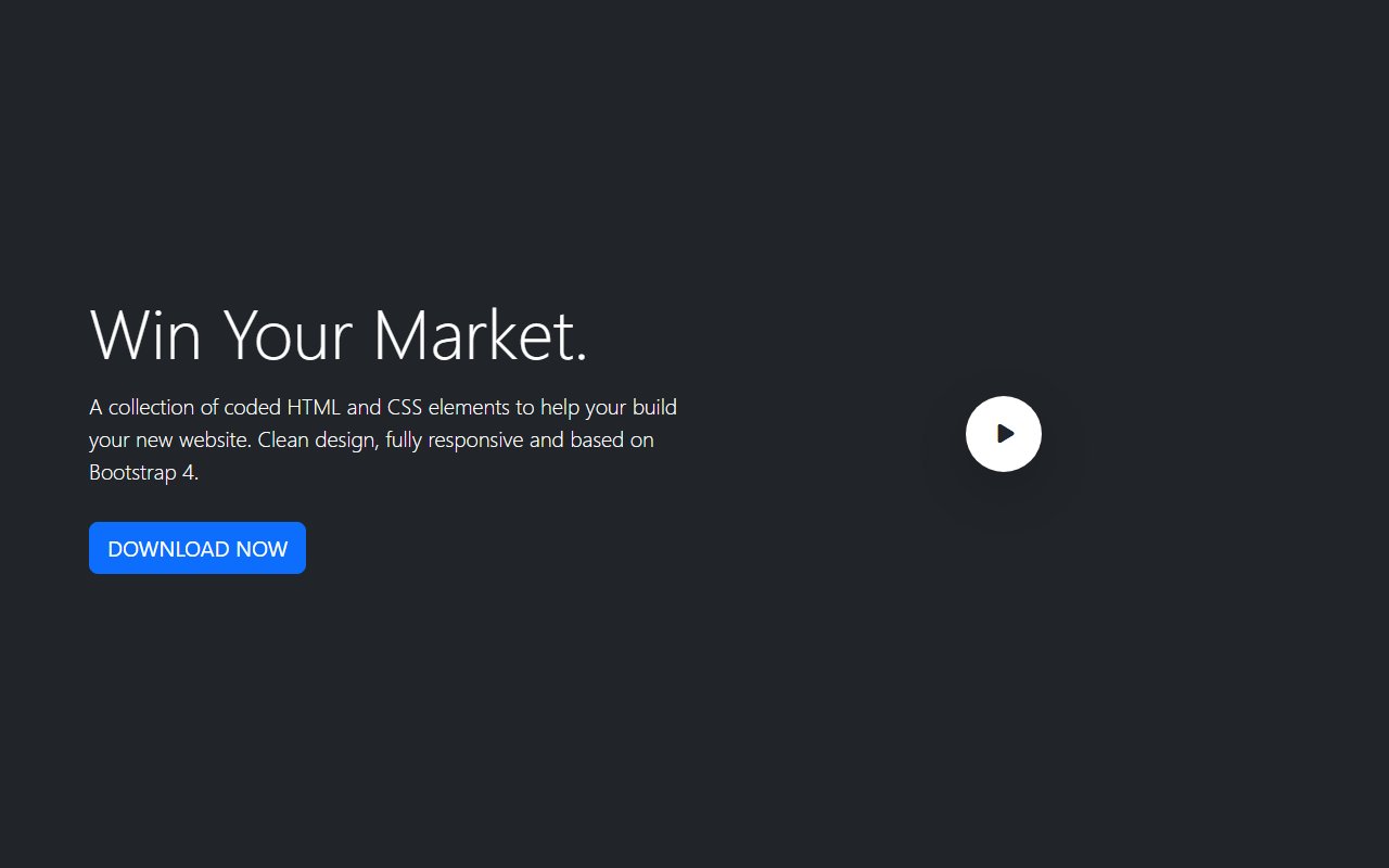
A solid navbar handles mobile collapse, active states, dropdowns, and keyboard focus out of the box. Starting from a tested snippet saves hours compared to wiring Bootstrap or Tailwind markup from scratch — especially when you need sticky headers, mega menus, or dark-mode toggles.
Best practices for navigation UI
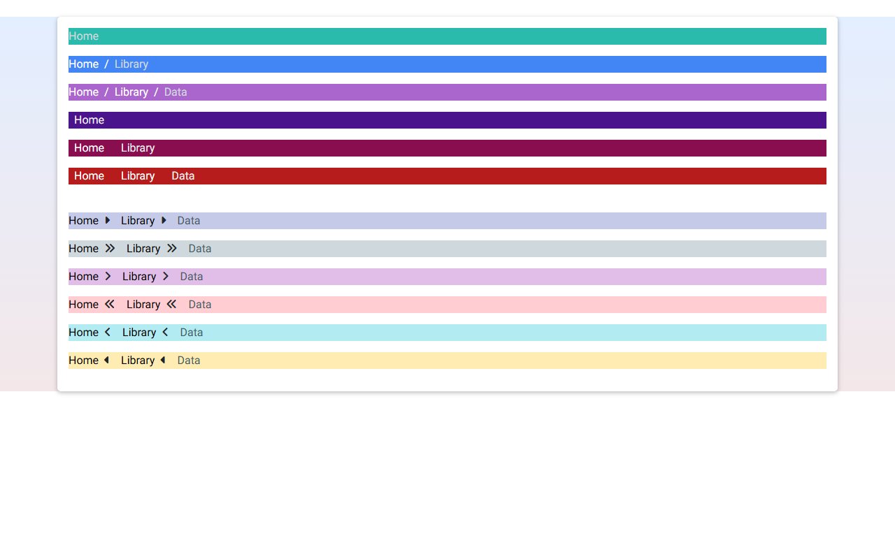
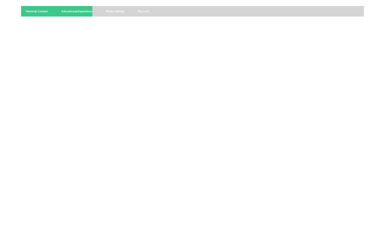
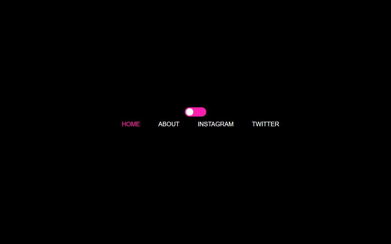
Keep primary links visible on desktop, use a clear hamburger pattern on mobile, and label icon-only controls with aria-label. Prefer semantic <nav> landmarks, ensure focus rings remain visible, and test tab order through dropdown items.
Yes. Copy the HTML structure into a React component and replace static links with your router (Link from next/link). Keep class names intact for Bootstrap or Tailwind styling.
Navbar snippets
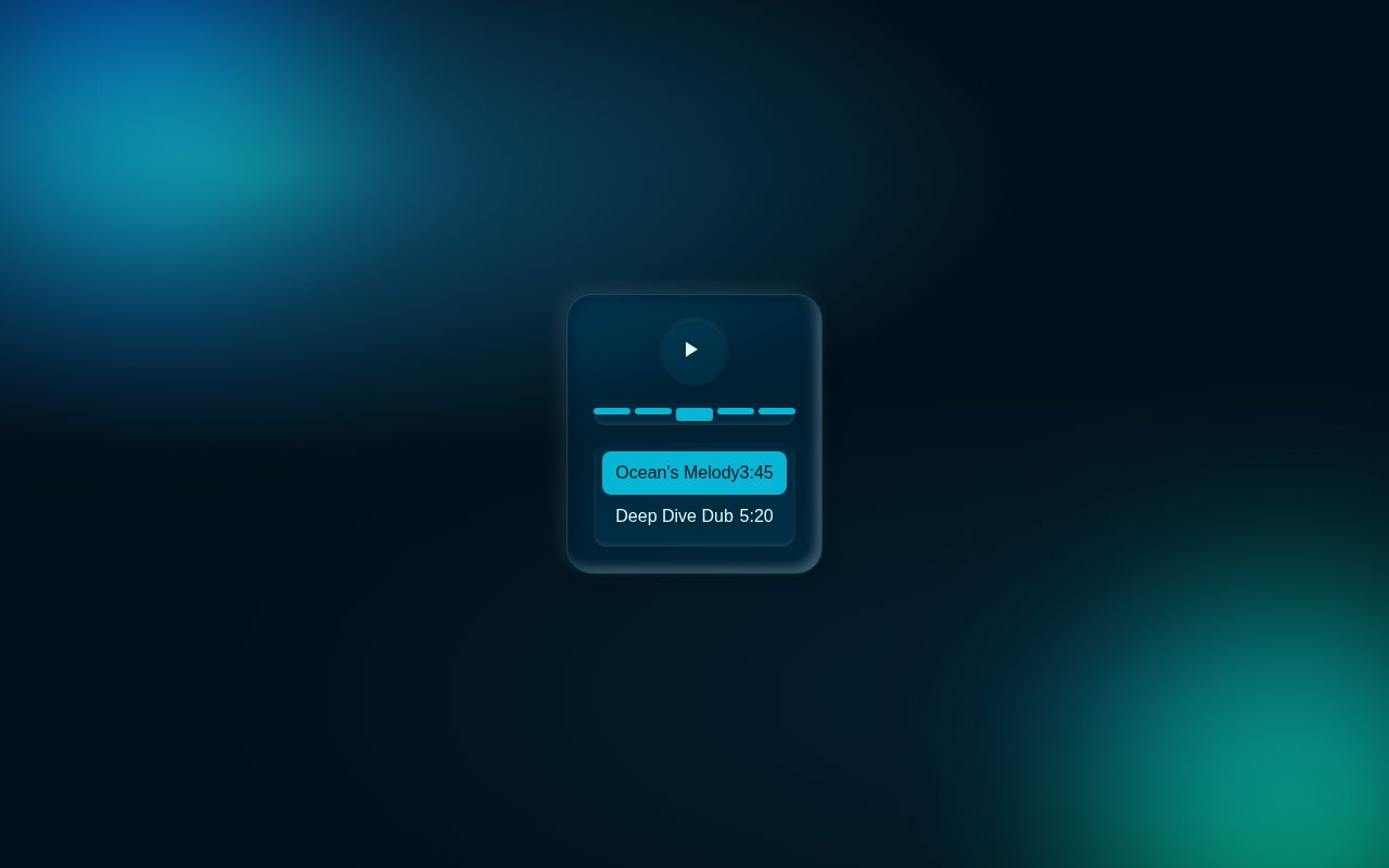
Trending now
Trending Tailwind components
Popular examples from the wider library while you browse this category.