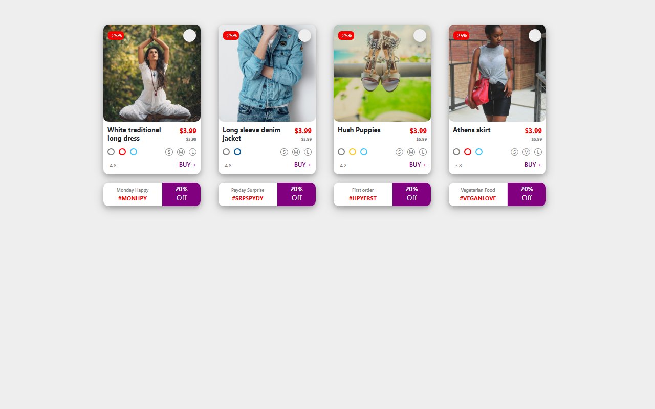
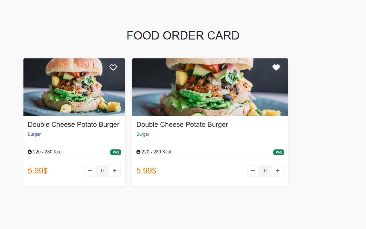
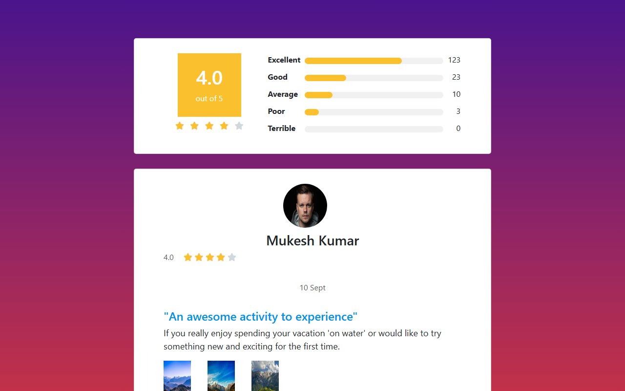
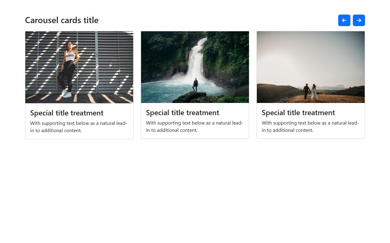
Developers reach for horizontal cards on mobile feeds, glassmorphism overlays on marketing sites, and dense stat cards on admin panels. Each snippet here demonstrates spacing, typography hierarchy, and hover states you can adapt quickly.
Responsive card grids
Use CSS Grid or Bootstrap row/col classes so cards reflow from one column on phones to three or four on desktop. Keep touch targets at least 44px and maintain consistent aspect ratios for thumbnail images.
For Bootstrap, override CSS variables or utility classes. For Tailwind, swap bg-, border-, and text- utilities. All snippets include the source CSS or classes in the code block.
Cards snippets
Trending now
Trending Bootstrap snippets
Popular examples from the wider library while you browse this category.