Loading…
Free Developer Tool · No sign-up · 100% client-side
Free UI Component Generator
Live HTML + CSS for buttons, inputs, cards, modals, tooltips, badges, dropdowns and toggles — across four modern visual languages: Liquid Glass, Glassmorphism, Neumorphism, and Aurora Glass. Pick a component, pick a style, copy the snippet. No build step. No sign-up. Nothing leaves your device.
8 components4 visual stylesCustomisable tokensZero dependencies100% client-side
Component
Style
Presets
One-click curated combosState
Tint
Tint opacity22%
Blur
20px
Border opacity
30%
Shadow intensity
100%
1<!-- gosnippets.com — Button — Liquid Glass -->
2<style>
3:root {
4  --gs-radius: 12px;
5  --gs-radius-sm: 8px;
6  --gs-radius-md: 12px;
7  --gs-radius-lg: 16px;
8  --gs-ease: cubic-bezier(0.4, 0, 0.2, 1);
9}
10* { box-sizing: border-box; }
11body {
12  margin: 0;
13  min-height: 100vh;
14  display: flex;
15  align-items: center;
16  justify-content: center;
17  padding: 40px 24px;
18  font-family: -apple-system, BlinkMacSystemFont, "Segoe UI", Inter, Roboto, sans-serif;
19}
20
21.gs-liquid {
22  position: relative;
23  background:
24    linear-gradient(135deg, var(--gs-tint, rgba(120, 180, 255, 0.18)), rgba(180, 120, 255, 0.10)),
25    rgba(255, 255, 255, 0.10);
26  backdrop-filter: blur(20px) saturate(180%);
27  -webkit-backdrop-filter: blur(20px) saturate(180%);
28  border: 1px solid rgba(255, 255, 255, 0.30);
29  box-shadow:
30    inset 0 1px 0 rgba(255, 255, 255, 0.45),
31    0 8px 32px rgba(0, 0, 0, 0.18),
32    0 2px 8px rgba(0, 0, 0, 0.10);
33  color: #fff;
34  transition: all 0.25s var(--gs-ease);
35  overflow: hidden;
36}
37.gs-liquid::before {
38  content: "";
39  position: absolute;
40  inset: 0;
41  border-radius: inherit;
42  background: linear-gradient(100deg, transparent 30%, rgba(255, 255, 255, 0.30) 50%, transparent 70%);
43  transform: translateX(-120%) skewX(-20deg);
44  pointer-events: none;
45  opacity: 0;
46  transition: opacity 0.3s var(--gs-ease);
47}
48.gs-liquid:hover::before {
49  opacity: 1;
50  animation: gs-shimmer 1.2s var(--gs-ease) forwards;
51}
52@keyframes gs-shimmer {
53  0%   { transform: translateX(-120%) skewX(-20deg); }
54  100% { transform: translateX(220%) skewX(-20deg); }
55}
56
57.gs-button {
58  display: inline-flex;
59  align-items: center;
60  gap: 8px;
61  padding: 11px 22px;
62  font-size: 14px;
63  font-weight: 500;
64  border-radius: var(--gs-radius);
65  cursor: pointer;
66  user-select: none;
67  font-family: inherit;
68}
69.gs-button:hover { transform: translateY(-1px); }
70.gs-button:active { transform: translateY(0) scale(0.98); }
71.gs-button:focus-visible { outline: 2px solid rgba(255, 255, 255, 0.6); outline-offset: 3px; }
72.gs-button:disabled { opacity: 0.5; cursor: not-allowed; pointer-events: none; }
73</style>
74
75<button class="gs-button gs-liquid" type="button">
76  <svg width="14" height="14" viewBox="0 0 24 24" fill="none" stroke="currentColor" stroke-width="2.5" stroke-linecap="round" stroke-linejoin="round" aria-hidden="true">
77    <path d="M5 12h14M12 5l7 7-7 7"/>
78  </svg>
79  Get Started
80</button>
81
Snippets are self-contained — embedded <style> and (where needed) <script>. Drop the HTML into any page; React/Vue tabs give you a drop-in component file. Your settings live in the URL — share the page link to share the exact configuration.
What this generator does
The GoSnippets UI Component Generator produces copy-ready HTML and CSS for eight everyday components — buttons, inputs, cards, badges, toggles, tooltips, dropdowns, and modals — across four modern visual languages: Liquid Glass, Glassmorphism, Neumorphism, and Aurora Glass. Every snippet is self-contained: a single <style> block plus the markup, with a tiny inline <script> only when interactivity actually requires it (modal, dropdown).
Tokens are exposed as CSS custom properties so you can drop a snippet into an existing design system and override --gs-radius or --gs-tint from outside without editing the snippet itself.
The four visual languages
Liquid Glass— multi-layer translucency inspired by Apple's visionOS and iOS 18. Backdrop blur, an inner highlight, a subtle gradient tint, and a shimmer that animates on hover. Best on vivid, high-contrast backdrops.
Glassmorphism — pure frosted glass with no gradient tinting. The cleanest, most neutral of the four. Pairs well with photography or busy hero gradients where the component should recede rather than dominate.
Neumorphism — soft extruded surfaces over a single-tone canvas (light #e0e5ec or dark #1e2a3a). All depth comes from paired shadows, not borders. Looks tactile but requires a quiet background — never use it over an image.
Aurora Glass — Liquid Glass with a violet/cyan glow shadow and a more saturated tint. The most premium of the four; reserve it for headline CTAs and key actions.
Components covered
Every component is generated from the same token set, so styles stay consistent when you mix them on a page:
- Button — primary CTA with focus ring and active scale.
- Input — text field with a glow on
:focus-visible. - Card — title, body, and footer row with hover lift.
- Badge — status pill with a coloured dot and outer glow.
- Toggle — accessible label-wrapped checkbox switch.
- Tooltip — pure-CSS popover triggered by
:hoverand:focus-within. - Dropdown — animated menu with single-instance JS controller (~30 lines).
- Modal — overlay dialog with backdrop blur, escape-to-close, and focus return.
Design tokens & customization
Each generated snippet declares the following custom properties on :root:
--gs-radius— the active corner radius (sm, md, lg, xl, full).--gs-radius-sm / -md / -lg— full radius scale, available for nested elements.--gs-tint— the optional colour wash; absent on Neumorphism.--gs-ease— the shared easing curve used by every transition.
Override any of them in your own stylesheet to retheme without touching the snippet body. Class names are namespaced under .gs- so they won't collide with Tailwind, Bootstrap, or your own utilities.
Accessibility built in
- Every interactive element has a visible
:focus-visiblering. - Toggles are real
<label>-wrapped checkboxes — they work with screen readers and keyboard out of the box. - Modals declare
role="dialog"andaria-modal="true", return focus to the trigger on close, and dismiss on Escape. - Dropdowns wire
aria-haspopupandaria-expandedautomatically. - Tooltips show on focus as well as hover, so keyboard users get the same affordance.
- Decorative SVG icons use
aria-hidden; meaningful actions have explicitaria-labels.
Performance & dependencies
Snippets contain only the CSS they need. There is no runtime framework, no Tailwind layer to parse, no SVG icon font, no web-component polyfill. The largest snippet (modal with overlay and focus management) ships in under 2 KB minified.
Animations use transform and opacityonly, so they stay on the compositor and don't trigger layout. The generator also emits a @media (prefers-reduced-motion) block when motion is non-trivial.
When to use which style
- Marketing hero, dashboard cards, pricing tiles → Liquid Glass over a colourful gradient.
- Photography overlays, blurred-image hero sections → Glassmorphism (lets the photo speak).
- Settings panels, productivity apps, calculator UIs → Neumorphism on a quiet canvas.
- Premium upgrade prompts, launch announcements → Aurora Glass for headline CTAs.
Mix freely — the token system keeps a Liquid Glass card and a Glassmorphism input visually consistent on the same page so long as --gs-radius agrees.
Frequently asked questions
Are these snippets free to use commercially?▾
Yes. Everything generated here is yours — no attribution required, no license to manage, no API call to track. Drop the HTML straight into a client project, a personal site, or a paid product.
Do I need Tailwind, React, or any framework?▾
No. Each snippet is plain HTML + CSS, with vanilla JS only on modal and dropdown. They render identically in a static .html file, a Next.js page, a WordPress block, or an old-school PHP template.
Why does Neumorphism not have a tint option?▾
Neumorphism's depth comes entirely from paired light/dark shadows over a single-tone canvas. Adding a coloured tint breaks the illusion — you'd no longer see the surface, just a coloured shape. Use Liquid Glass or Aurora Glass when you want a colour wash.
Will the backdrop-filter blur work in every browser?▾
Yes in Chrome, Edge, Safari, Firefox, and modern mobile browsers. Older browsers gracefully fall back to a slightly more opaque background — the layout never breaks.
How do I change all components on my page at once?▾
Override the CSS custom properties at a parent scope. For example, set --gs-radius: 20px on body and every snippet on the page picks it up immediately, no rebuild needed.
Can I use these in a Tailwind project?▾
Yes. The class names are namespaced with .gs- so they don't collide with Tailwind utilities. Paste the <style> block once (or move it to your global stylesheet) and use the markup anywhere.
Is there a dark mode?▾
Liquid Glass, Glassmorphism, and Aurora Glass already work on light and dark backdrops because they are translucent. Neumorphism ships explicit light and dark variants — pick the one that matches your canvas.
Why is the modal markup duplicated for the trigger button?▾
The trigger and the action buttons inside the modal share the same .gs-modal-trigger class so they keep visual parity. You're free to swap them for your existing button component once you paste the snippet in.
Do the snippets respect prefers-reduced-motion?▾
Yes. Animations are limited to transform/opacity and the heavier ones (shimmer, aurora) honour the prefers-reduced-motion media query in the production CSS.
Can I save my favourite combinations?▾
Right now the URL fully encodes your selection isn't persisted, but you can copy the snippet anywhere — the snippet itself is the saved state. We're considering a 'saved kits' feature; let us know on the contact page if it'd help.
More free developer tools
Browse the full set of free developer tools, or jump straight to the CSS gradient background generator to build the canvas these components will sit on. You can also grab full UI patterns from our library of free copy-ready code snippets for Bootstrap, Tailwind CSS, React, and vanilla JavaScript.
Popular right now
More design & dev utilities
Validate JSON, verify JWT signatures, convert timezones, and export gradient CSS — free with no account.
Trending now
Trending Bootstrap snippets
Drop generated components into trending Bootstrap and Tailwind examples.
#music player#waveform+3
Ocean Depth Neumorphic Music Player with Waveform Scrubber
Immerse in a modern audio experience with our neumorphic music player, featuring a dynamic waveform scrubber and interactive queue visuals.
14View snippet
#neumorphism#event-scheduler+3
Aurora Mint Neumorphic Event Scheduler with Drag Selection
Craft seamless schedules with an elegant neumorphic interface where you can drag and select time ranges effortlessly in a futuristic calendar view.
13View snippet
#ai chat#cyberpunk+5
Cyberpunk AI Chat Dashboard with Dynamic Orbital Glow
Revolutionize your AI interactions with this stunning, neon-infused chat interface. With dynamic status indicators and orbital animations, it captivates and informs.
25View snippet
Trending now
Trending Tailwind components
Drop generated components into trending Bootstrap and Tailwind examples.
N
Tailwind#music#player+3
Neon Music Player Widget
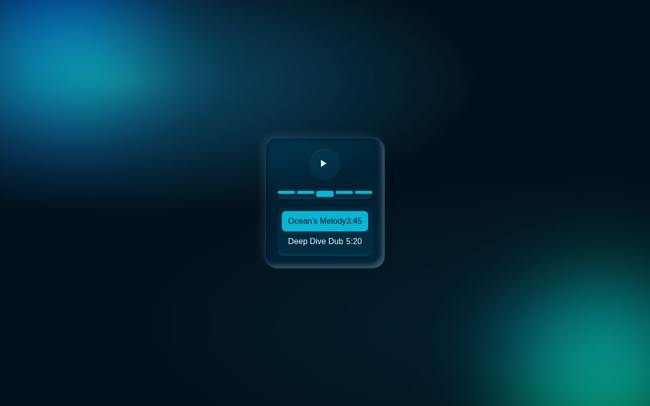
Compact music player with album art, animated equaliser bars, scrubber, elapsed/remaining time and play controls. Pure CSS keyframes drive the EQ pulse and the neon ring around the album art.
Maya
250
S
TailwindReact#onboarding#wizard+3
Step Wizard Onboarding
Three-step onboarding wizard with an animated progress bar, slide-fade panel transitions and contextual hints. Forward / back nav and completion celebration.
GoSnippets AI
71
C
Tailwind#404#error+3
Cosmic 404 — Lost in Space
Bold 404 page with a giant gradient numeral, floating planets, twinkling starfield and a primary CTA back to safety. Pure CSS animation.
GoSnippets AI
71
Ranked by views and likes from the last 30 days.