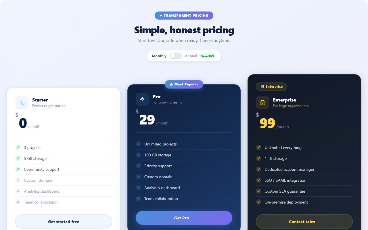
1function App() {
2  const [yearly, setYearly] = React.useState(true);
3  const plans = [
4    { name: "Starter", monthly: 0,  yearly: 0,   blurb: "For getting started", features: ["Up to 3 projects","Community support","Basic analytics"], cta: "Get started", featured: false, accent: "#22d3ee" },
5    { name: "Pro",     monthly: 19, yearly: 15,  blurb: "For growing teams",   features: ["Unlimited projects","Priority support","Advanced analytics","Custom domains"], cta: "Start free trial", featured: true, accent: "#a855f7" },
6    { name: "Scale",   monthly: 79, yearly: 63,  blurb: "For serious orgs",    features: ["Everything in Pro","Dedicated success rep","SLA & uptime guarantees","SSO + audit logs"], cta: "Contact sales", featured: false, accent: "#f472b6" },
7  ];
8
9  return (
10    <section className="price-stage min-h-screen px-4 py-12 sm:py-16 flex flex-col items-center">
11      <span className="price-orb orb-a" />
12      <span className="price-orb orb-b" />
13
14      <header className="relative text-center max-w-2xl mb-9">
15        <span className="inline-flex items-center gap-2 px-3 py-1 rounded-full text-[11px] font-bold uppercase tracking-[0.18em] mb-4 price-pill">Pricing</span>
16        <h1 className="text-white font-bold leading-tight tracking-tight mb-3" style={{ fontSize: "clamp(1.75rem, 4vw, 2.5rem)" }}>
17          Simple pricing. <span style={{ background: "linear-gradient(135deg,#22d3ee,#a855f7)", WebkitBackgroundClip: "text", WebkitTextFillColor: "transparent" }}>No surprises.</span>
18        </h1>
19        <div className="flex items-center justify-center gap-3 mt-5">
20          <span className={`text-sm font-semibold ${!yearly ? "text-white" : "text-slate-400"}`}>Monthly</span>
21          <button type="button" role="switch" aria-checked={yearly} onClick={() => setYearly((v) => !v)} className={`price-switch ${yearly ? "is-on" : ""}`}>
22            <span className="price-switch-knob" />
23          </button>
24          <span className={`text-sm font-semibold ${yearly ? "text-white" : "text-slate-400"}`}>Yearly</span>
25          <span className="price-save inline-flex items-center gap-1 text-[10.5px] font-bold uppercase tracking-[0.14em] px-2 py-0.5 rounded-full">Save 20%</span>
26        </div>
27      </header>
28
29      <div className="relative grid grid-cols-1 md:grid-cols-3 gap-4 w-full max-w-5xl">
30        {plans.map((p) => (
31          <div key={p.name} className={`price-card relative rounded-2xl p-6 sm:p-7 ${p.featured ? "is-featured" : ""}`} style={{ "--accent": p.accent }}>
32            {p.featured && <span className="absolute top-3 right-3 px-2 py-0.5 rounded-full text-[10px] font-bold uppercase tracking-[0.14em]" style={{ background: p.accent + "22", color: p.accent, border: "1px solid " + p.accent + "55" }}>Most popular</span>}
33            <h3 className="text-white font-bold text-lg mb-1">{p.name}</h3>
34            <p className="text-slate-300/65 text-[12.5px] mb-5">{p.blurb}</p>
35            <div className="flex items-baseline gap-1.5 mb-6 price-value">
36              <span key={yearly ? "y" : "m"} className="price-value-num text-5xl font-black text-white tracking-tight">${yearly ? p.yearly : p.monthly}</span>
37              <span className="text-sm font-medium text-slate-400">/ mo</span>
38            </div>
39            <ul className="space-y-2.5 mb-7">
40              {p.features.map((f) => (
41                <li key={f} className="flex items-center gap-2.5 text-[13px] text-slate-200/85">
42                  <span className="inline-flex items-center justify-center w-4 h-4 rounded-full" style={{ background: p.accent + "26", border: "1px solid " + p.accent + "55" }}>
43                    <svg className="w-2.5 h-2.5" viewBox="0 0 24 24" fill="none" stroke={p.accent} strokeWidth={3}><path strokeLinecap="round" strokeLinejoin="round" d="M5 13l4 4L19 7" /></svg>
44                  </span>
45                  {f}
46                </li>
47              ))}
48            </ul>
49            <button type="button" className="price-cta w-full inline-flex items-center justify-center gap-2 rounded-xl px-5 py-3 text-white font-semibold text-[13.5px]">
50              {p.cta}
51            </button>
52          </div>
53        ))}
54      </div>
55    </section>
56  );
57}
Comments(0)
No comments yet — be the first to start the discussion.
Sign in to join the conversation.