
Accessibility note
Tooltips should supplement visible labels, not replace them. Ensure keyboard users can trigger them on focus, not hover alone.
Category · 4 snippets
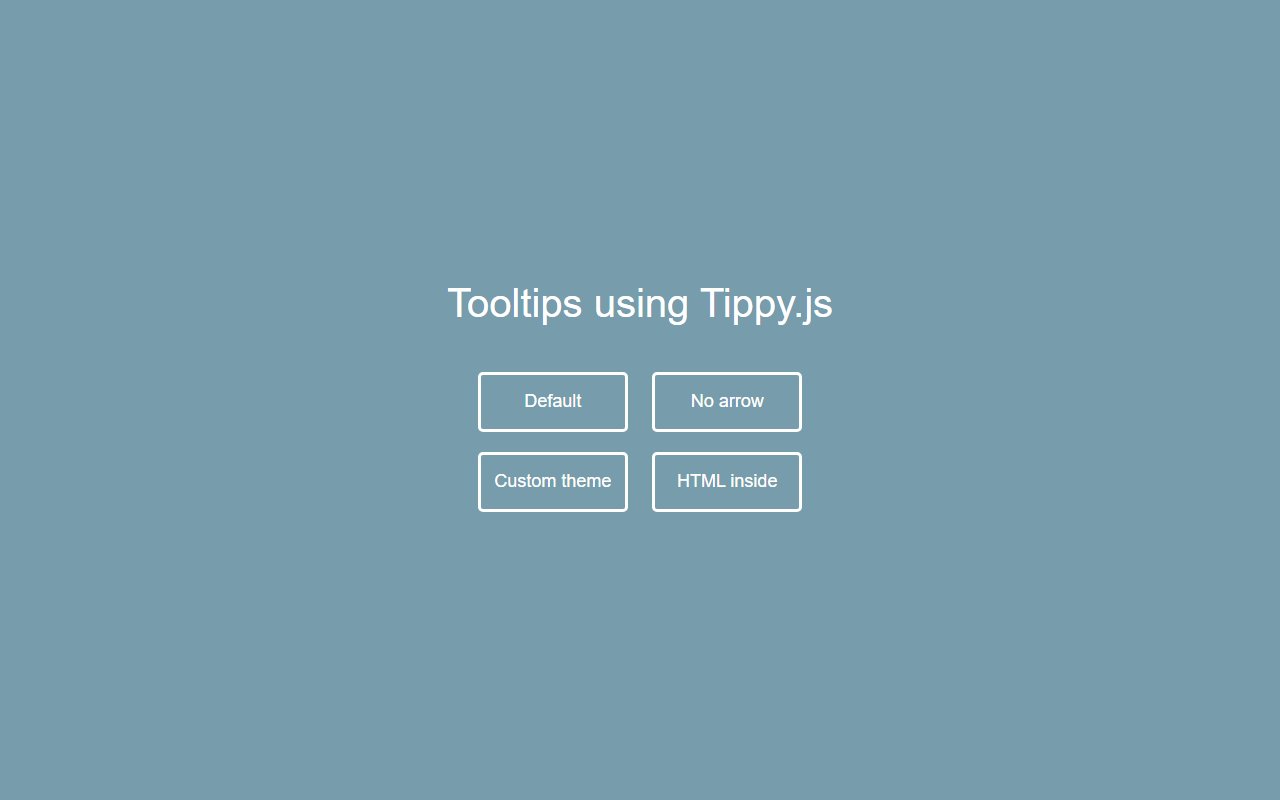
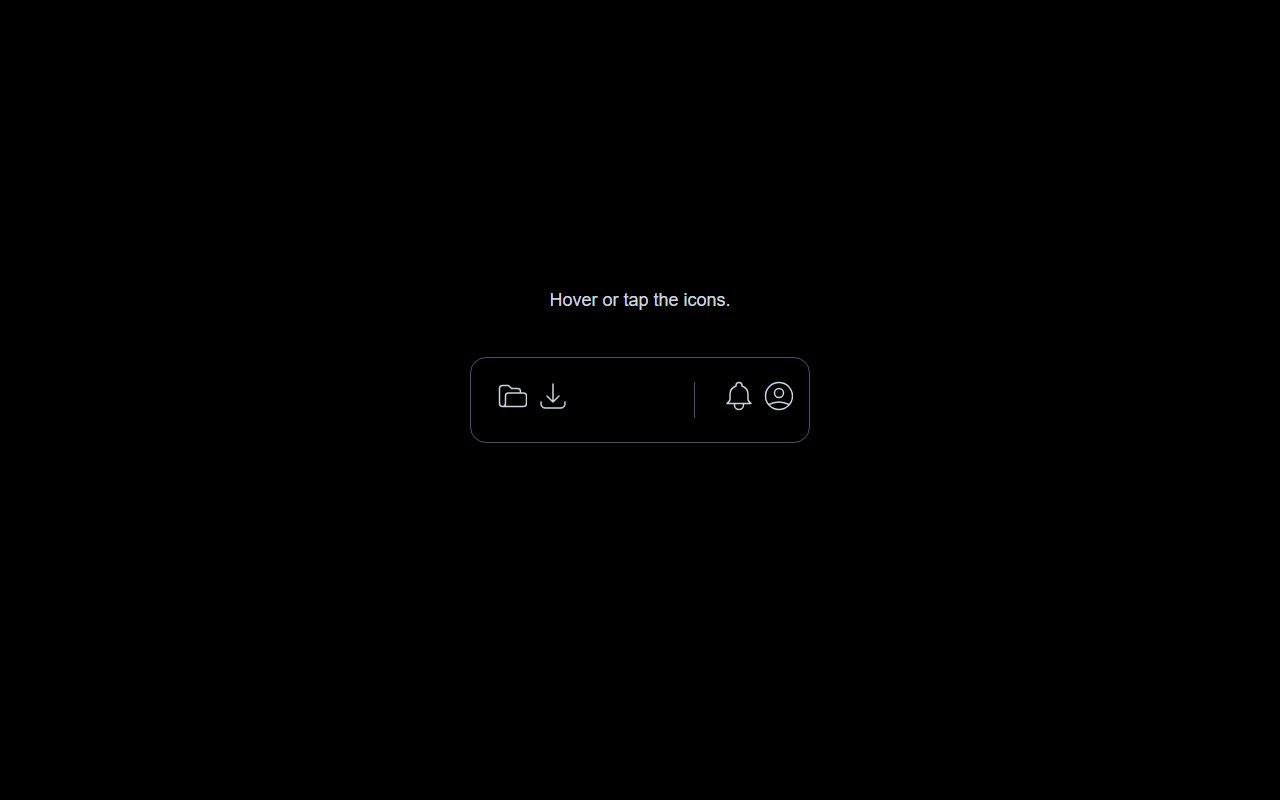
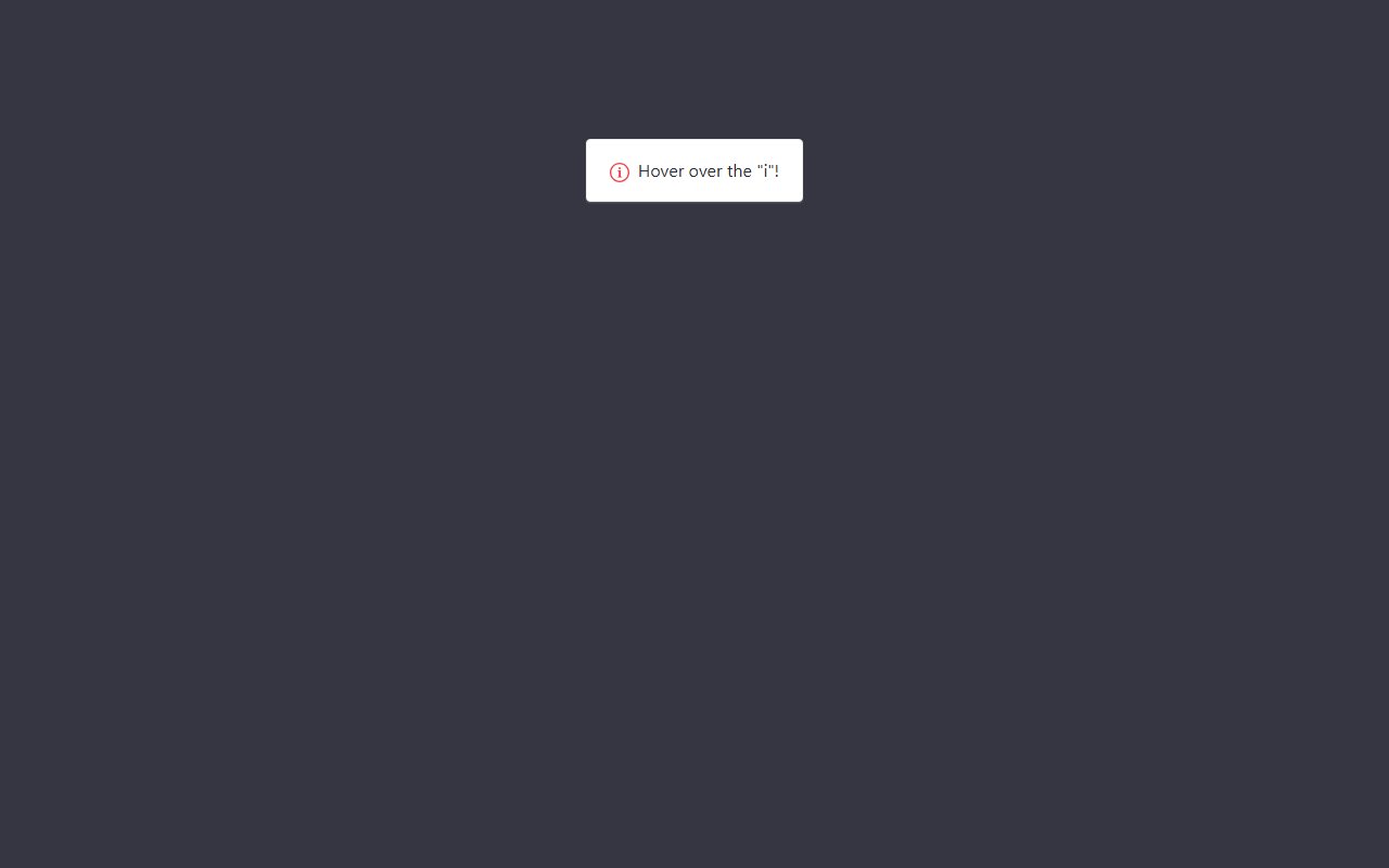
Tooltips and popover components
Showing 4 of 4 snippets
4 results
Tooltips and popover components
Tooltips should supplement visible labels, not replace them. Ensure keyboard users can trigger them on focus, not hover alone.
Bootstrap tooltips require their JS bundle. Some CSS-only snippets use title attributes or data attributes with pure CSS — see each snippet's code section.