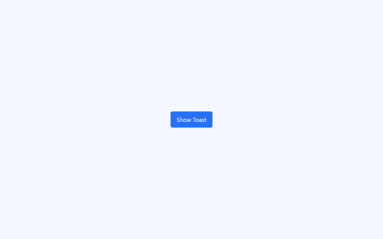
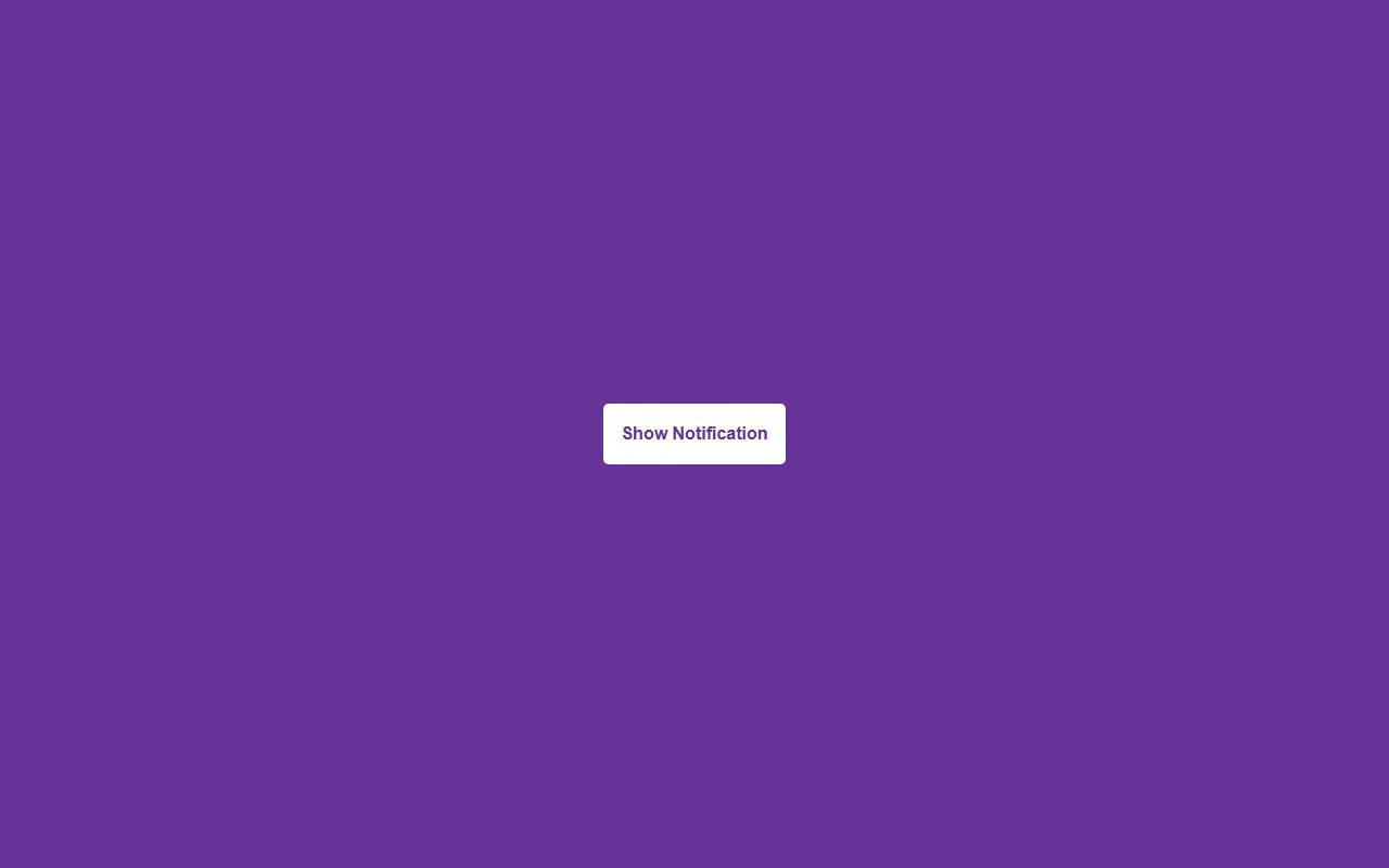

Alert vs toast patterns
Inline alerts belong near the content they describe. Toasts suit global notifications. Pick a snippet that matches your design system colors and iconography.
Category · page 2 of 3
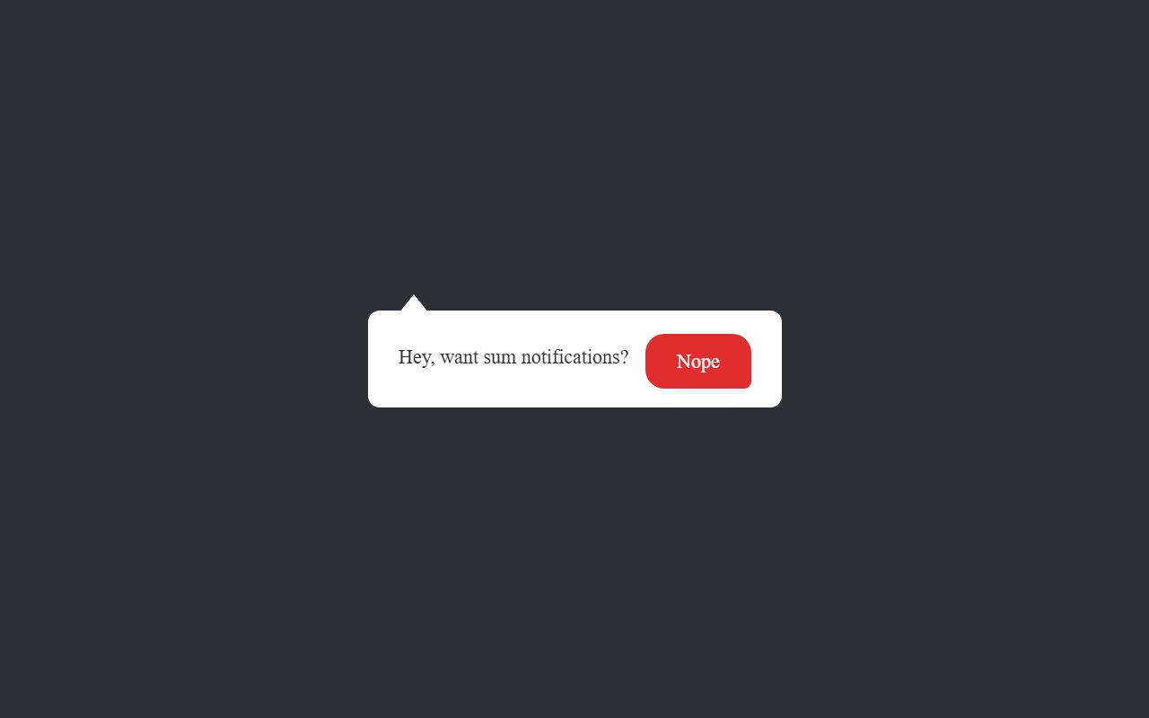
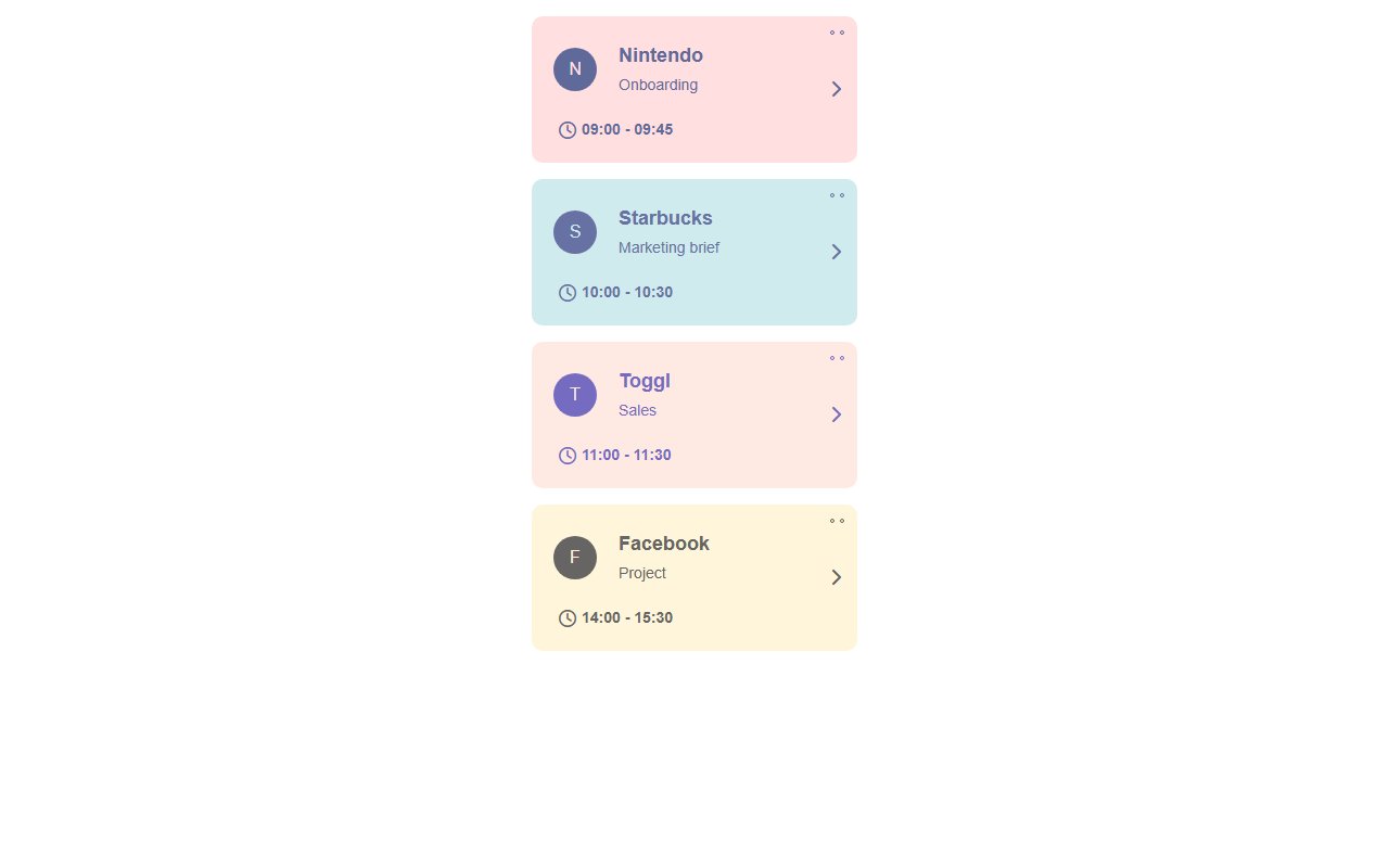
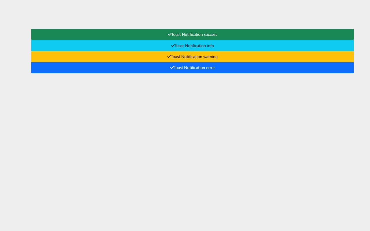
Notification banners and alert boxes
Showing 21 of 21 snippets
21 results
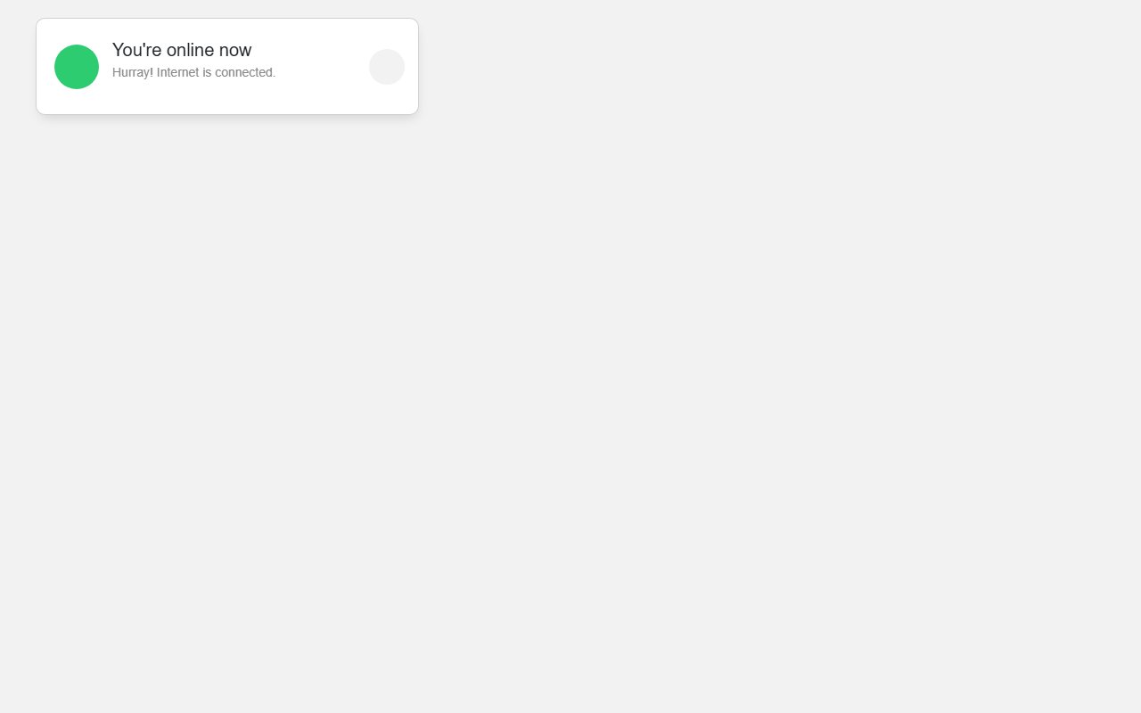
Notification banners and alert boxes
Inline alerts belong near the content they describe. Toasts suit global notifications. Pick a snippet that matches your design system colors and iconography.
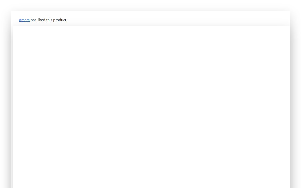
Bootstrap alerts support .alert-dismissible. Vanilla snippets often include a close button with aria-label — extend with your state management as needed.